Communicating with the Public
Document Accessibility
What is it?
The Americans with Disabilities Act, or ADA, protects the rights of people with disabilities. Document accessibility refers to making documents, webpages and presentations legible to people of all abilities. These practices should be incorporated to increase the accessibility of all City projects for the public. The following guidelines make digital media compatible with screen readers and accessible to people with sight, mobility and hearing disabilities. Screen readers are software programs that allow people with sight disabilities to read text displayed on a screen. Consult the City Web Team for support with accessibility features on webpages and web forms.
How to do it
All documents
For all documents, keep the following accessibility tips in mind.
- Consider people with sight disabilities when depicting data. Instead of using color as the only differentiator, use a combination of color, shapes and patterns to further distinguish different data on graphs, charts and maps.
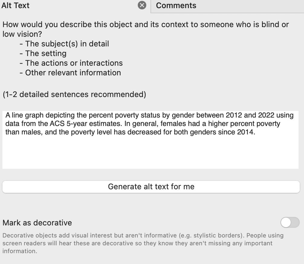
Add alternative text to graphics and charts that contain important information and functions. Alternative text is a written description conveying an image’s meaning. This makes documents compatible with screen readers so that people with sight disabilities do not miss any key information. Alternative text can easily be added in Microsoft Office and Adobe PDF. Note that alternative text is not the same as a caption.
- Consider using high-contrast colors when drafting documents and images. In most cases, a light background with dark text is preferred. Contrast-checking tools can help check for adequate contrast.
- Typefaces, font sizes and image sizes and quality will impact the legibility of a document.
- Design digital documents so that:
- People can navigate and complete all tasks using a keyboard.
- Information is ordered logically, typically from left to right and top to bottom.
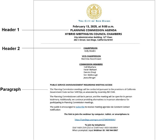
- Use headings appropriately, as screen reader users can type commands to find different parts of a document. Add screen reader labels that include the level of the heading, followed by the title of the heading.
- An accessibility check assesses potential barriers to accessibility and identifies areas for improvement. Applications such as Microsoft Office and Adobe Acrobat both have accessibility check options. In addition to built-in accessibility checkers, staff should also check for accessibility themselves. Run the document through Windows Narrator to ensure it reads correctly and help find any mistakes.
PDFs
The PDF format offers additional functionality not available in standard Word documents. Some of these features include user-fillable fields, interactive buttons and hyperlinks to flip to a certain section or page. When designing an interactive PDF, consider the following:
Label all fields with their function so that people using a screen reader know how to interact with the field. Field placeholders should also be used for easy comprehension of what entry is expected of the user.
For example, the label for a date field would be “Date,” and the placeholder for a date would be MM/DD/YYYY.
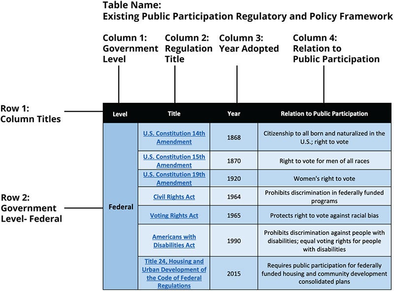
- Tag tables with the table name, column title and column number for easier legibility and navigation.
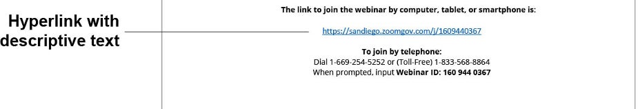
- Links should include screen reader-only text that explains the link rather than only the linked text. Provide a description for a link to help the reader understand the context.
Microsoft PowerPoint
- Enable live transcription on PowerPoint during presentations. Also, add captions to any video embedded in a PowerPoint presentation.
- Limit the use of animations and consider whether they will impact the readability of the material. If animations are used, provide a warning prior to any animations for people who may have photosensitivity or epilepsy.
Additional resources
Communicating with the Public
- Introduction
- Affirmative Language
- Clear, Simple and Inclusive Language
- Communication Strategies for Different Learners
- Conflict Management
- Document Accessibility
- Facilitation of Engagement Events
- Inclusive Graphic Design
- Nonverbal Communication
- Paid Advertising
- Public Speaking
- Translation and Interpretation
- Trauma-informed Outreach and Engagement